WEB RE-DESIGN
McDonalds. I wasn't lovin' it.

Scope
UI/UX Design, Wireframing & Prototyping
The Problem
Original design lacked modernity. The website structure was outdated and contained incorrect information. Overall, I felt the site lacked the cohesion and professionalism alligned with their brand image and other product offerings.

Research
Research consisted of looking through the different web pages, highlighting any potential weaknesses with the design. I also looked online to find any pain points other customers had.
Concept
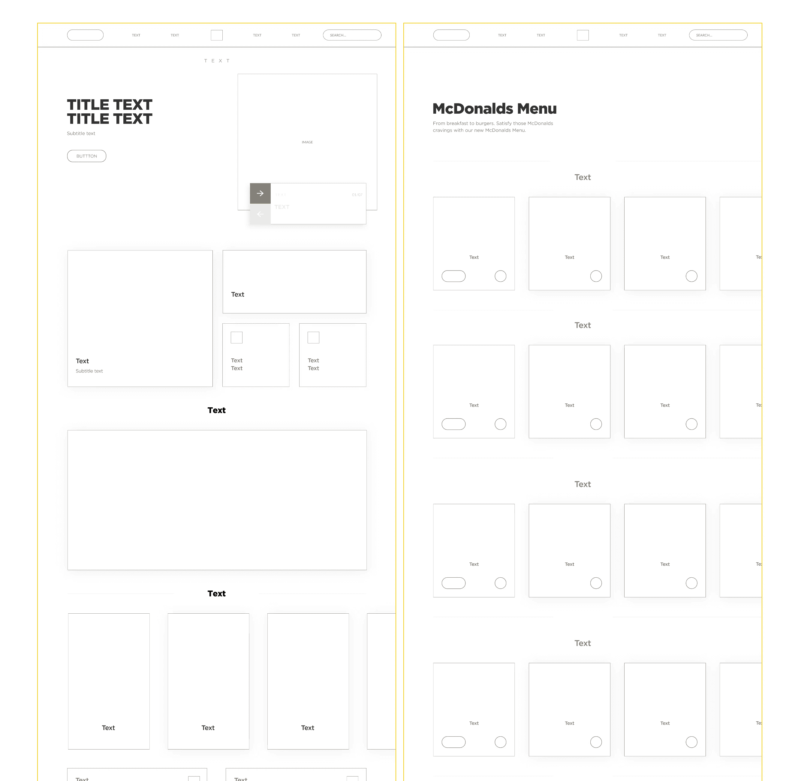
The concept was simple. Improve the original UI by modifying the content flow, whilst providing users with more information in a new seamless design which better suits the McDonalds brand. I started the process by creating some wireframes.
Iteration
After several rounds of iteration, I was able to use the initial sketches to produce a higher fidelity mockups, as you can see with the 'before and after' examples below.

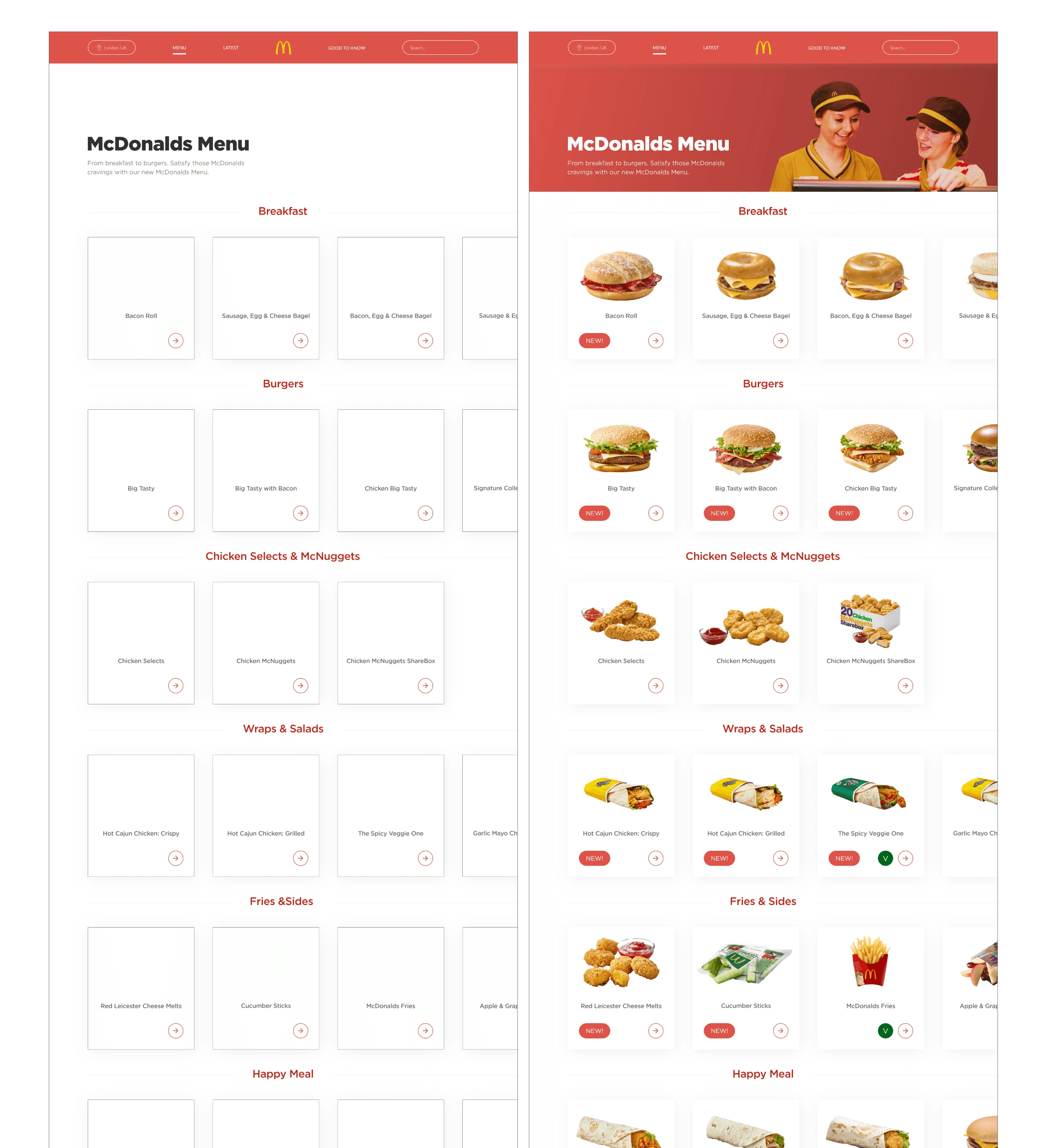
For the menu page, I felt the initial design lacked any additional useful information. I rectified this by implementing small indicators which could be placed on the item cards, for new or vegeterian products etc.
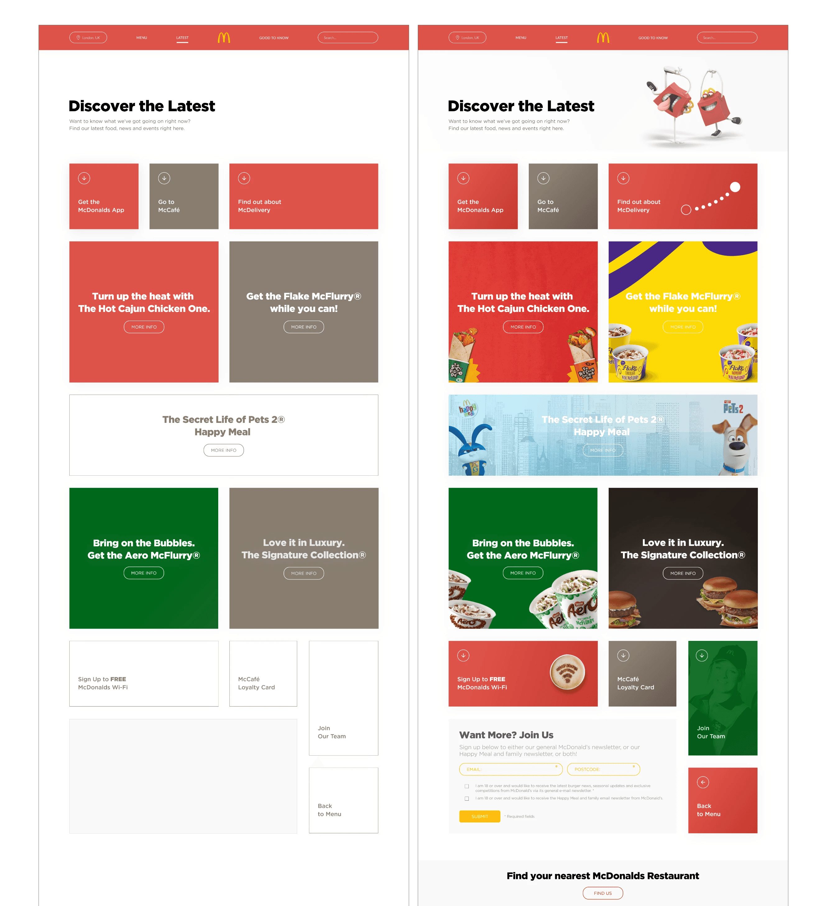
I continued the iteration process with the remaining pages, applying a consistent style across each of the different sections.
Final Product


Timeline
6 Week Design Process / Solo Project / 2021.